JOOL Mobile Health App
Conducting research and creating UX designs for an up-and-coming mobile app health startup. #design #research

Project Overview
JOOL Health, Inc. (now known as Kumanu) is a startup based in Ann Arbor, MI that developed the JOOL app, seeking to help people live healthier lives according to their purpose by improving their S.P.A.C.E. (Sleep, Presence, Activity, Creativity, and Eating).
I created, moderated, and recorded 15+ usability tests (50+ hours) in single day sprints for the app, alonside another UX researcher/designer from the Michigan iSchool. I synthesized the most important insights from these usability tests, in addition to generating recommendations from these insights that were implemented in future design iterations. I worked closely with the CTO, CEO, and CCO, used & mastered Axure and developed of lo-fi and hi-fi wireframes and prototypes.
COMPANY
JOOL Health (now Kumanu)
ROLE
UX Researcher + UX Designer
DURATION
May 2015 - Feb 2016
METHODOLOGY + TOOLS
Axure, Moderated Usability Testing, Adobe Illustrator, Persona Development
TEAM MEMBERS
Ram Kumarasubramanian
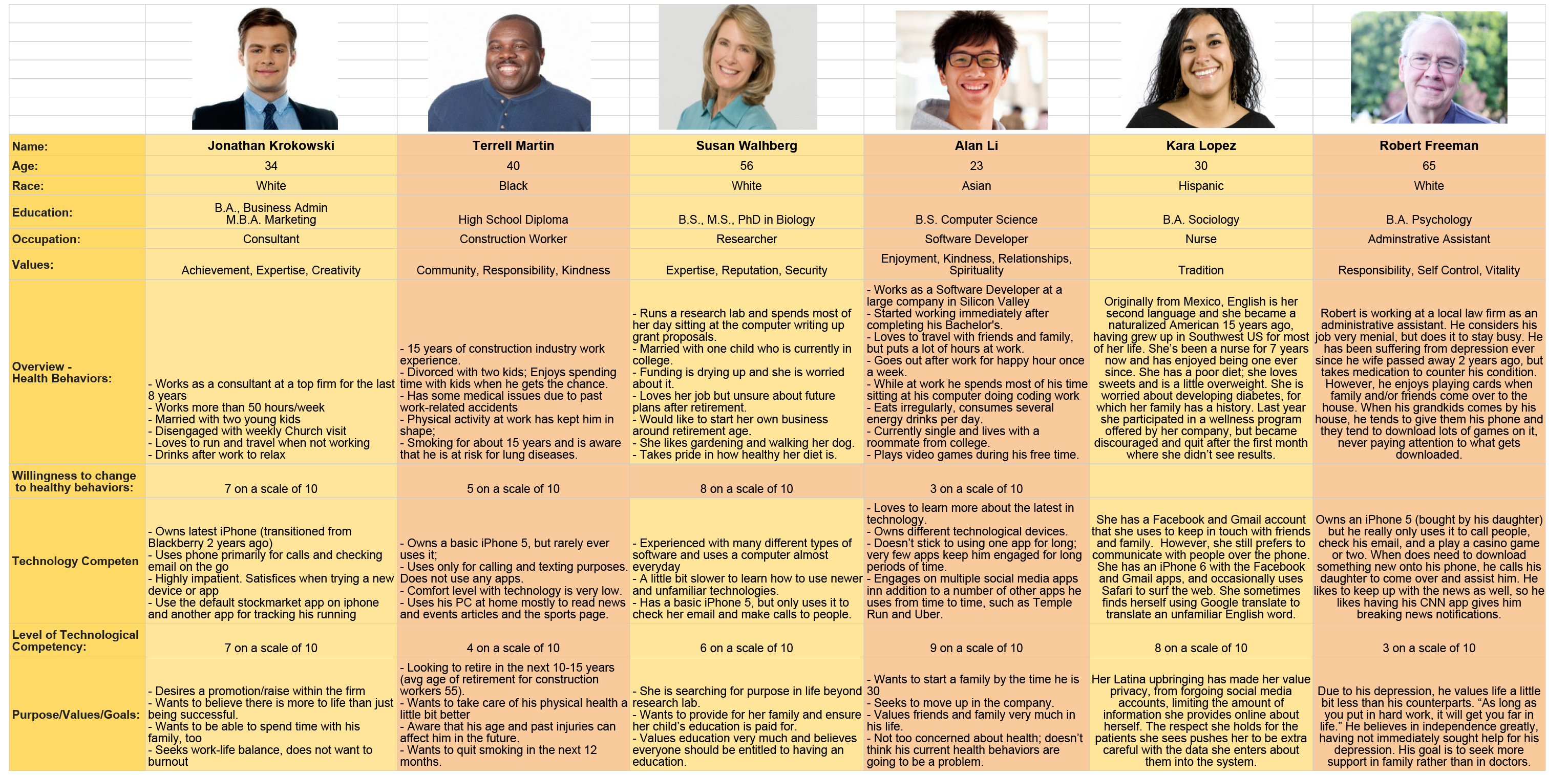
Provisional Personas
One of the first things I did at JOOL Health was create provisional personas. These were personas that I created primarly using secondary research, due to the limited resources and time constraints, but with the hopes of later validating and editing them via in-person interviews with potential customers.
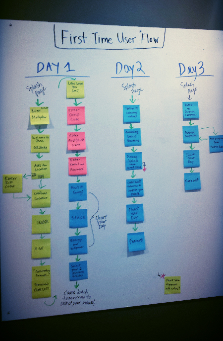
User Flow Diagrams
Just as the app was starting to take shape, I started to create user flows for the onboarding experience and future interactions. I decided to put it on the whiteboard as to have it visible to everyone on team. It really helped the team understand the user experience of the new user from a broader perspective.
Wireframe, Prototype, Test, Repeat!
We had a visual designer on the team who made the official hi-fidelity mockup screens for the mobile app, using our recommendations and wireframes from the usability tests we planned and conducted. Usually these recommendations and result share-out meetings were done with the CTO and CEO, in order to ensure that we were balancing both user needs and business goals.
Our usability tests were initially prioritized by the leadership team but as the summer went on, we started to tackle some design problems we found ourselves. Below are some of the major design problems we faced and the solutions I contributed to:
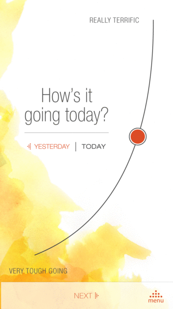
Motion Design to the Rescue
Motion was introduced to catch the attention of users that the red slider was to be moved (usability tests revealed users skipping this page). The easy way to solve this and many other problems is to explain with copy. But an interface should speak for itself! Later, after hypothesizing the curved line was more likely throwing people off (and to maintain consistency), the curved line was later re-designed to be straight.
Refining S.P.A.C.E.
Users charting their S.P.A.C.E. (Sleep, Presence, Activity, Creativity, and Eating) represents the core of the app, since their S.P.A.C.E. data will help power later features of the app that will make sense of that charted data. We went through various iterations until we got it right for users: Below are some of the major design problems we faced and the solutions I contributed to:
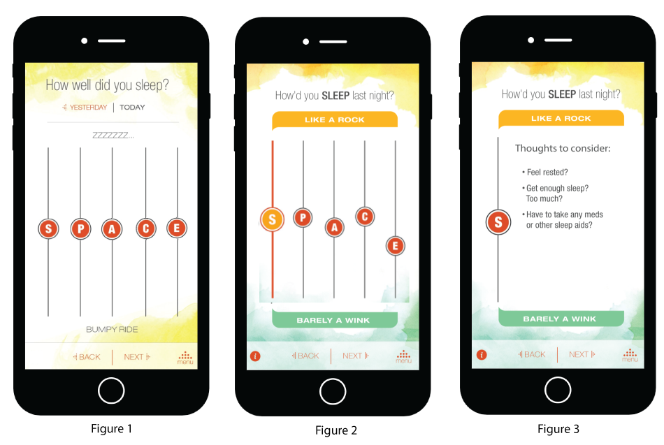
Usability tests on Figure 1 revealed that users didn't notice the question and labels at the top change when selecting another slider. Color and motion was then recommended to indicate that the labels at the top and bottom were changing (Figure 2), but then following tests revealed users wanted to know more about S.P.A.C.E. (especially "Presence") but where would we put it? I intially suggested a press and hold interaction to provide contextual information about a particular term, but it interferred with the sliding interaction, along with some development concerns.
We eventually decided to spread out each part of S.P.A.C.E. on a separate page (figure 3) giving more real estate for contextual information and reducing confusion about which part of S.P.A.C.E. they are charting, albeit creating more pages in this charting flow.
New Feature Onboarding
Progressive onboarding would be ideal, but this app needs to get on the road! So what we opted for was step by step onboarding to help users understand new features of the app as they appeared (video on left). With more time, we hope to get in this type of animation (video on right) to show where these onboarding screens are going, so that people will remember where to access them again. Google design guidelines to the rescue! Understanding their design guidelines has sure helped.
Iterative Usability Testing
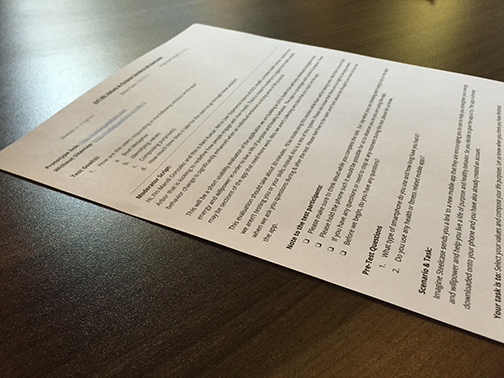
Initially, I did guerilla style usability testing (with the prototypes we made) with my UX comrade Ram at some Ann Arbor coffee shops. With our charm and charisma, we were able to get folks from all walks of life to participate in our usability tests. We understood the constraint of using Ann Arbor folks but we did our best at selecting a wide range of users. We did over 50 hours worth of testing, doing 1-2 sprints of tests (~5 tests per sprint) per week. Later, we were able to do scheduled usability tests with organizations who were interested in our product. Usability testing taught us a lot about moderation, note-taking, when its appropriate to interrupt, how to keep users feeling comfortable, and more.
Usability testing taught us a lot about moderation, note-taking, when its appropriate to interrupt, how to keep users feeling comfortable, and more. Read more about my experience with guerilla usability testing and how do it on my Medium blog.
Reflection
Taking the initiative to do things was critical, given that we are working in a fast paced environment (agile scrum, to be exact). Instead of explaining ideas that I had for the app, I would rather sketch them out first, which ended up being a better way of communicating my ideas.
However, I would always try to communicate my ideas to the right people, and that included the leadership of the company, the CEO, COO, and especially the CTO (Chief Technology Officer). It was important to know whether something I was prototyping was do-able by the development team. It also had to go by the Chief Creative Officer, so that he could see if it fit the creative vision and language of the product. I’ve learned that communicating ideas is a good start but communicating them to the right people is even more important.