Personalized Homepage
Evaluating The Home Depot's proposed strategy around personalizing the homepage experiences for customers across the site experience.
Project Overview
Home Depot’s homepage digital experience has traditionally been more marketing-driven than customer-driven, so the Homepage team looked at creating a personalized homepage primarily driven by customer data and behaviors. My research study evaluated this proposed personalized homepage experience via moderated prototype testing that I did with customers remotely.
The results helped the team validate their design decisions before development began their work and ultimately the experience was launched, yielding an increase in conversion and engagement from the homepage, particularly with items under the “Buy it Again” section.
COMPANY
The Home Depot
ROLE
UX Researcher
DURATION
Jan - Feb 2020
METHODOLOGY
Moderated Prototype Testing
Context + Problem
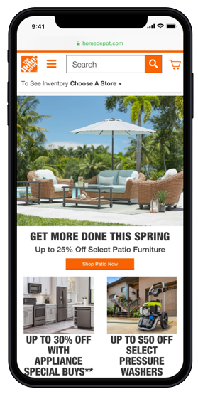
The Home Depot (est. 1978) is the largest home improvement retailer in the U.S., with their e-commerce platforms seeing continuous growth year after year. Recent site analytics showed that the amount of users who scroll on the homepage was around 5%, so the homepage team wanted to look at ways to help the homepage be more engagement and helpful to customers. The team wanted to test a potential solution first before development would begin. They wanted to test a personalized homepage that showcased the customer’s information upon landing on the page.
Research Objective
The research objective then became to Understand how customers react and respond to a personalized THD homepage.
Study Questions
- Which cards or aspects of the homepage is important to customers?
- What do customers want to accomplish on the homepage?
- Do customers know that they are on the THD’s homepage?
My Role + Team
I was the lead researcher end-to-end, from kickoff, recruitment, analysis and reporting. I also worked with the Senior Product Manager + Senior UX Designer.
Study Design
Methodology
Moderated Prototype Testing (n=6) on Desktop
Rationale
This was an evaluative type of study because we evaluating a proposed solution. It was moderated because there was opportunity to dig deeper around customer goals and motivations around the homepage, something not done previously.
Target Audience + Tools
Our target audience was quite simple for this study, where we screened for users who continue to shop with The Home Depot online (in other words, Home Depot customers). We used the UserTesting platform to recruit and schedule the sessions remotely and used InVision to host the prototype.
Analysis
To analyze and synthesize the collected data, I looked at notes that my notetaker took and used the collaboration whiteboarding tool Miro to transform the data into sticky notes that I grouped into meaningful themes (affinity mapping exercise). I then took the most impactful notes to find associated videos with them to include in the final report.
Insights & Recommendations
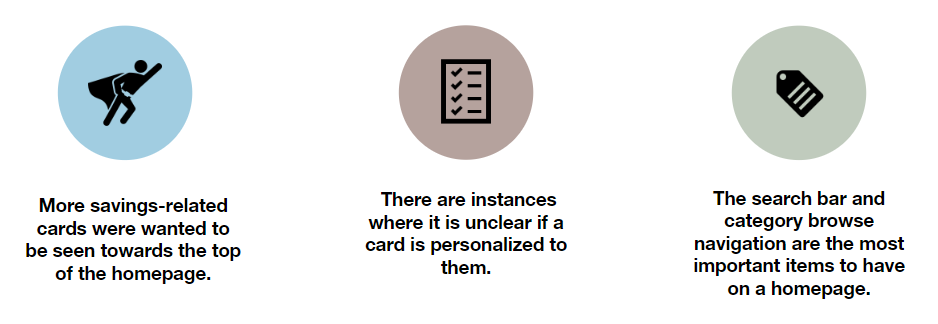
Here is a snapshot of what the executive summary of insights looked like when I presented the report to stakeholders:
With the insights in tow, I was able to make the following Recommendations for the team:
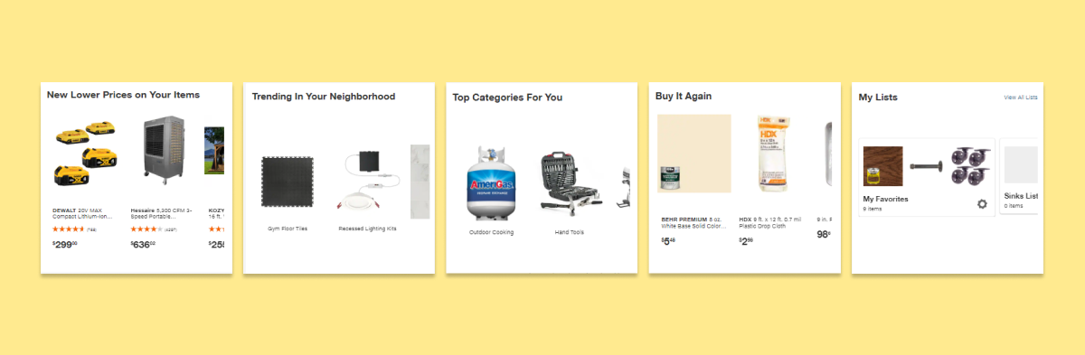
- Ensure savings-related cards are prioritized (higher up) on the homepage.
- Make it clearly visible what is personalized versus what is not personalized, for example, displaying text that says “based on your order history”.
- Contextualize cards by placing them next to each other in proximity to help the user understand how they are personalized to them. Seeing “Order History” next to “Finish Your Paint Project”
- Ensure search and browsing mechanisms are not lost on the homepage, even go as far ensuring category browsing is made visible on the homepage.

Impact
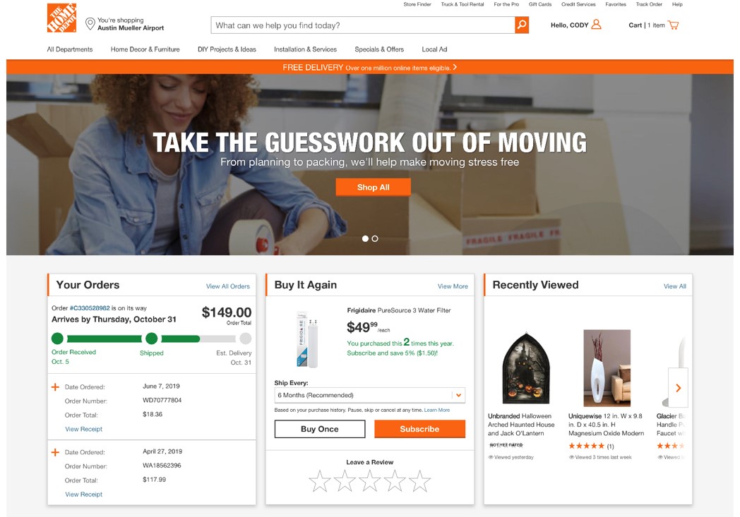
- Continuous user testing and a redesign months later resulted in the homepage launched to be personalized to customers.
- The redesign launch led to an increased scroll rate of 40% on the new homepage experience. This in turn also led to an increase in conversion and engagement, specifically for products under the “Buy Again” section.
Reflection
What could have gone better?
- Doing mobile testing instead or in addition to the desktop testing (mobile-first philosophy)
- Tested different use cases (what if you aren’t logged in? what if you haven’t shopped in awhile?)
- Involved more stakeholders outside of product, like the Marketing team.
Positives
- Team was really impressed by my ability to manage the project in terms of keeping them in the loop as the project progressed and how organized I was when kicking off the project to showcasing insights back to the team.
- This was a great opportunity to work on something so visible to customers on the website.